Help page
GREAT:SCAN:patterns
GREAT:SCAN:patterns performs an automated and systematic analysis of periodic patterns in the position of a set of genomic features of interest along the genome. A complete analysis runs in three steps: detection of all possible periods from the positions of the genomic features, clustering of genomic features that are “in-phase” for every significant period found, and mapping of all the regions of the genome showing periodicities.
Input data and parameters
Your input data must be a two or three-columns table containing in the first column the identifier (the gene, or genomic feature, you wish to study), in the second column (optional) the chromosome number, and in the last column the absolute position of those elements on the genome. The columns can be separated by commas, spaces, semicolons or tabulations. Data can be provided as file or typed directly. An uploaded file can be edited from the text area.
You must specify the name and position of four elements at least.
To have a clear idea on what the input data must look like, feel free to use the 'Try with example data' feature of the web interface. It will load automatically correctly-formatted sample data for Lrp targets genes in E. coli. You may also download this dataset.
The information used in this example dataset was extracted from RegulonDB and gene position was retrieved from the E. coli EcoCyc “SmartTables” resource.
Additional example datasets
Using the procedure described above, we also collected data for other major transcription factors targets (operons or genes) in E. coli. The summary of these datasets (name, number of genomic features, download links) is reported in the table below. Feel free to use any of these dataset to get started with GREAT:SCAN:patterns.
| Dataset | Number of genomic features | Download link |
|---|---|---|
| ArcA target genes | 53 | Download |
| CRP target genes | 289 | Download |
| CRP target operons | 116 | Download |
| Fis target genes | 66 | Download |
| FNS target genes | 100 | Download |
| H-NS target genes | 18 | Download |
| IHF target genes | 129 | Download |
| Lrp target genes | 25 | Download |
| NarL target genes | 51 | Download |
Parameters
Parameters regarding the organism in which the analysis is performed (genome length, average gene-to-gene distance), the period discovery (p-value thresholds) and the clustering of ''in-phase'' genomic features (cluster size, cluster exponent) can be adjusted. Information on these parameters can be found directly on the web interface using the tooltips ( icons).
Results and visualizations
The output page obtained using the sample data can be found here.
The following three visual outputs are produced during the GREAT:SCAN:patterns analysis:
Periods (periodogram)
An example of generated periodograms (inspired by the periodograms in spectral analysis), using the available sample data, is shown in figure 1. This plot provides a quick overview of the detected periods observed in the positioning of the genomic features. It illustrates the result of the first step of the GREAT:SCAN:patterns analysis. The difference between the normalised (upper panel of figure 1) and the raw (lower panel of figure 1) periodograms is that the calculated p-value for each period is corrected for multiple testing in the first case (normalised p-value). Only periods with a p-value below the normalised p-value cut-off will be considered for further analysis.
This first step of analysis is preceded by the replacement of genomic features that are proximal to each other by their barycentre. This step is necessary to avoid artificial blow-up of the statistical assessment of periods.
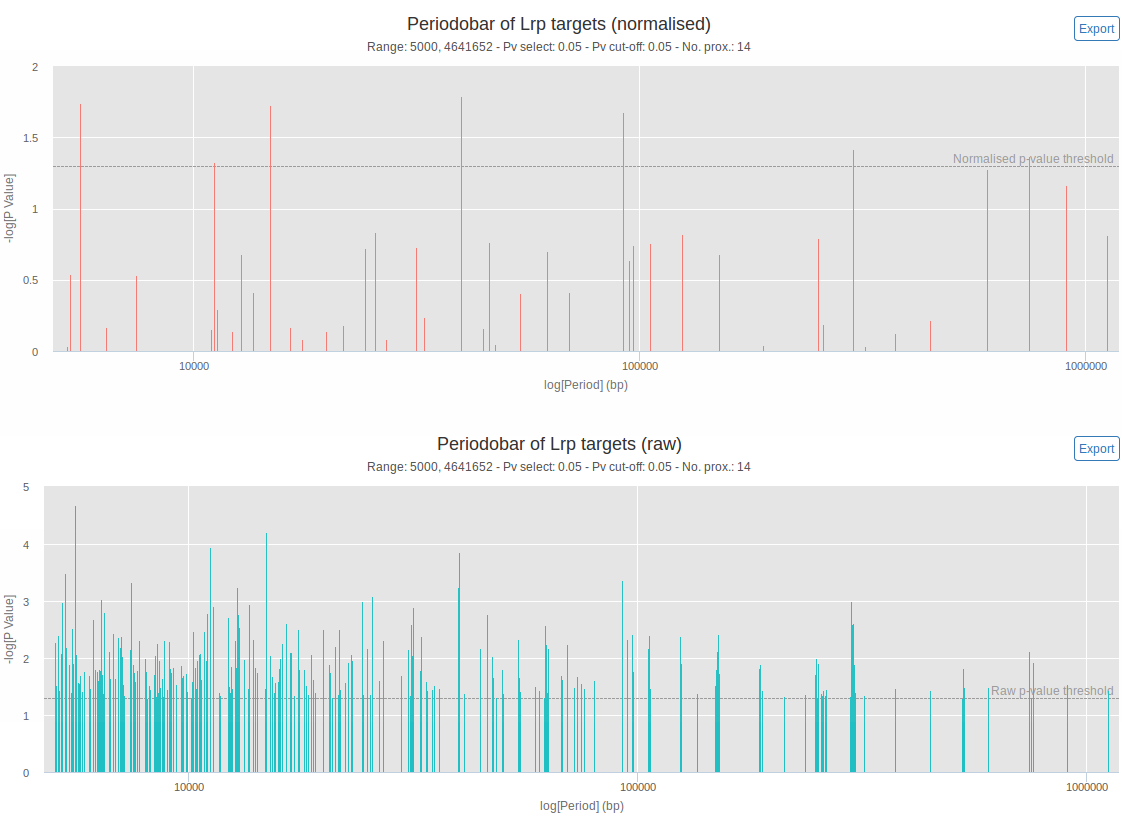
Figure 1: Normalized (upper panel) and raw (lower panel) interactive periodograms. Height of the bars indicates the significance of each periods (-log(p-value), which means that higher bars will correspond to lower p-values). On the x-axis is the length of each period in bp (logarithmic scale). The horizontal dashed lines correspond to the user-specified p-value threshold (with correction for multiple testing on the upper panel, without on the lower panel). The 'no. prox.' value corresponds to the number of data points left after the proximity removal. Mousing over a period gives the exact length and p-value associated to this period. It is also possible to zoom on and to export each chart. These plots were generated using the available sample data (26 Lrp target genes) with p-value thresholds of 0.05.
Clusters (clustergram)
Each significant period (each period that was above the normalised p-value threshold) is visualised by an intuitive plot called the clustergram. In a clustergram, the horizontal axis represents the angular coordinate of the phase-view of each genomic feature. The vertical axis unrolls the successive position of genomic features on the circular coordinates. An example of a generated clustergram, using the available sample data, is shown in figure 2. The clustergram reports the clusters detected by DBSCAN (a density-based clustering algorithm, used during second step of the GREAT:SCAN:patterns analysis) and provides the users with visual evidence of potential three-dimensional proximity of the genomic features. If no cluster were found for a given period, no clustergram is produced.
The positional score shown on the right y-axis for each genomic feature is a measure of how much each individual feature has contributed to the significance of this period. Genomic features with high positional score are more likely to be members of a cluster and may provide evidence for spatial co-localisation of clustered genes.
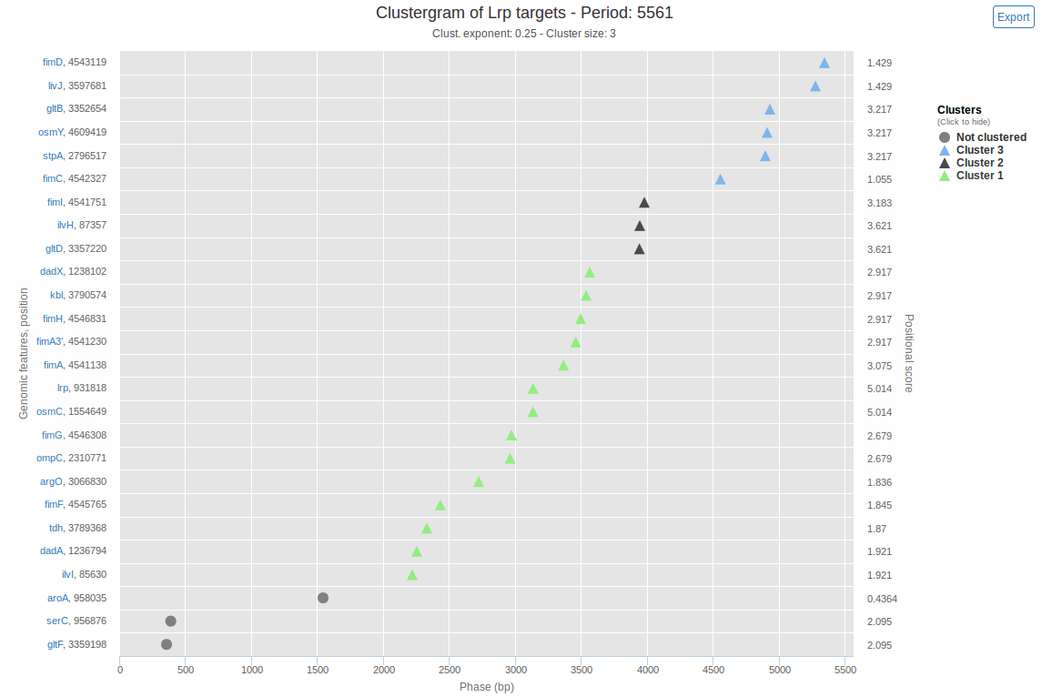
Figure 2: Interactive clustergram. The x-axis spans the length of the current period (in bp) and corresponds to the phase (modulo-coordinates for this period) of genomic features. On the left y-axis is the name and coordinates of genomic features, on the right y-axis is the positional score of genomic features. Through this visualization, ''in-phase'' genomic features appear aligned vertically. Clustering is depicted by displaying genomic features belonging to the same cluster in the same color, and un-clustered data as grey points. Clicking on a genomic feature's name links to a search on QuickGO with this name, enabling simple information search about genomic features. Each cluster can be shown or hidden by clicking the corresponding label in the legend. Mousing over a point gives the phase, position, cluster and positional score of the corresponding genomic feature. It is also possible to zoom on and export the plot. The plot was generated using the available sample data (26 Lrp target genes), a cluster exponent of 0.25 and a minimum cluster size of 3.
Chromosome map
So far we considered periods spanning the full length of the genome, and each found period refers to the full set of genomic features as it is positioned on the whole genome. There might however be cases where only a certain chromosomal region displays periodic arrangement. The chromosome map, presented in figure 3, shows regions of the chromosome that exhibit periodicity.
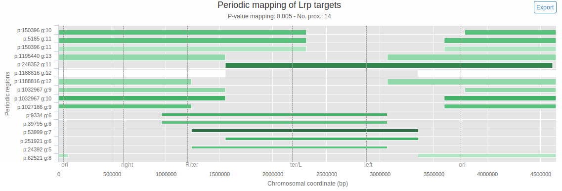
Figure 3: Interactive chromosome map. The x-axis spans the whole chromosome (chromosomal coordinates, in bp, are indicated). The y-axis is used only to order detected periodic regions, based on their total length. Each horizontal bar corresponds to a region of the chromosome where the input genomic features show significant periodicity. For each bar, period length (p) and number of genes that contributed to this period (g) are displayed on the y-axis. For each periodic region, the extremities of the bar delimit the region, the thickness is proportional to the number of genomic features contained in it, and the bar darkness is correlated to the significance of the period (the darker it is, the more significant it is). The vertical dashed lines correspond to user-specified ticks (here they represent the borders of the E. coli macrodomains). The 'no. prox.' value corresponds to the number of data points left after the proximity removal. Mousing over a bar gives the p-value, number of genes and coordinates of the corresponding periodic region. It is also possible to zoom on and to export each chart. The map was generated using the available sample data (26 Lrp target genes) and a mapping p-value threshold of 0.005.
GREAT:SCAN:multipatterns
GREAT:SCAN:multipatterns is an extension of GREAT:SCAN:patterns. It performs, in a systematic way, an automated analysis of regular arrangements in organisms having multiple chromosomes, for different transcription factors (or regulators, conditions) at the same time. This tool reports and allows identification of periodic regions of target genes for the different conditions, on each chromosome.
Input data and parameters
GREAT:SCAN:multipatterns takes two datasets as input:
- Gene positions: a three-columns, semicolon separated file containing the genomic locations of genes. It must respect the following structure: 'gene_name';'chromosome';'gene_start_site'.
- Conditions and targets: a file containing the targets of each transcription factor or condition you wish to study. Each line starts with the TF/condition's name followed by the names of its targets.
Data can be provided as files or typed directly. Uploaded files can be edited from the text areas of the input page.
To have a clear idea on what the input data must look like, feel free to use the 'Load sample data' feature of the web interface. It will load automatically correctly-formatted sample data corresponding to transcription factors (TF), their targets and the positions of the targets on the genome in S. cerevisiae. It was extracted from a map of regulatory sites of S. cerevisiae, reported by MacIsaac et al. in 2006 (link in references). You may also want to download these example files (gene positions, TF and targets).
Parameters (advanced settings)
Minimum targets of a regulator/condition by chromosome: the minimum number of target genes that a regulator/condition must have per chromosome so that the periodicity detection algorithm will calculate proper statistics (default: 3).
P-value threshold for selection of periods: the p-value threshold for the initial filtering of periods.
Selection percentage of top periods per chromosome: the percentage threshold to select the most significant periods per chromosome.
Concise information on the input data and these parameters can also be found directly on the input page using the tooltips ( icons).
Results and visualizations
An output page obtained using the sample data can be found here.
The following visual outputs are produced during the GREAT:SCAN:multipatterns analysis:
Chromosome maps
Chromosome maps are the main output of this tool. They depict the periodic regions found by the program on each chromosome in a legible way. An example of chromosome map obtained using the sample data is shown in figure 4.
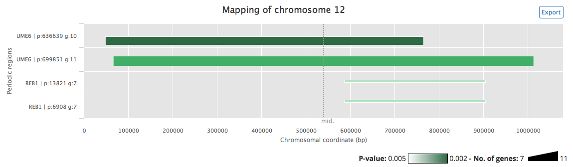
Figure 4: Chromosome map of chromosome 12 of S. cerevisiae. The x-axis spans the whole chromosome (chromosomal coordinates, in bp, are indicated). The y-axis is used only to order detected periodic regions, based on their total length. Each horizontal bar corresponds to a region of the chromosome where the input gene targets of one or more TF/conditions show significant periodicity. For each bar, period length (p) and number of genes that contributed to this period (g) are displayed above it, and corresponding TF/conditions names (TF) are displayed below it. For each periodic region, the extremities of the bar delimit the region, the thickness is proportional to the number of genomic features contained in it, and the bar darkness is correlated to the significance of the period (the darker it is, the more significant it is). The map was generated using the available sample data and the default parameters.
Periodograms
An example of generated periodogram, using the available sample data, is shown in figure 5. This plot provides a quick overview of the detected periods observed in the positioning of the targets of the studied TFs (or conditions, regulators). It is similar to the peridogram presented in the 'GREAT:SCAN:patterns' section. One periodogram per chromosome is produced.
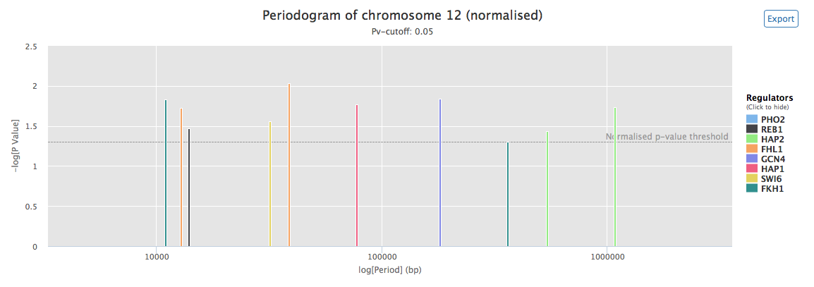
Figure 5: Normalized interactive periodogram for chromosome 12 of em>S. cerevisiae. Height of the bars indicates the significance of each periods (-log(p-value), which means that higher bars will correspond to lower p-values). On the x-axis is the length of each period in bp (logarithmic scale). Colors of the bars correspond to regulators. The horizontal dashed lines correspond to the user-specified p-value threshold. Mousing over a period gives the regulator, exact length and p-value associated to this period. Periods corresponding to a given regulator can be shown or hidden by clicking the corresponding label in the legend. It is also possible to zoom on and to export each periodogram. This plot was generated using the available generated using the available sample data and the default parameters.
Interactive tables
Detailed results returned at each step of the execution of the algorithm can be browsed using interactive tables (figure 6). Tables can also be downloaded as flat .csv files and as an SQLite database (machine-readable format).
Tables represent all the data the is generated in the 3 intermediate stpes of GREAT:SCAN:multipatterns. In details:
- measure of the proximity effect.
- full computation of the periodic patterns for all regulators/conditions
- filtered periods by chromosome
- Regulator/condition - target pairs and their position on each chromosome
- Regulator/condition - target pairs and thier position on each chromosome, after removal of proximities
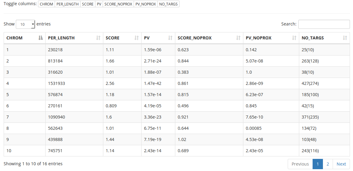
Figure 6: Interactive table for the first step of GREAT:SCAN:multipatterns. Every column of the selected table can be displayed or hidden using the “toggle columns” buttons. Searching is possible for the content of all columns of the currently displayed table. Table data can be sorted by one or more columns. Basic information about the table is displayed at the bottom of it. If there are too many rows to display, the table is splitted into multiple pages. This table was generated using the available sample data (transcription factors from S. cerevisiae) and the default parameters.
GREAT:SCAN:PreCisIon
GREAT:SCAN:PreCisIon (for “PREdiction of CIS-regulatory elements improved by positION”) is a multi-view boosting algorithm for transcription factor binding sites (TFBS) prediction. It uses two different sources of information to perform predictions: in addition to the usual sequence classifier (a DNA sequence motif represented as a TFBS position-weight matrix), a global position classifier is used. No other tool relies on such information for TFBS prediction.
PreCisIon builds a strong gene target classifier by adaptively combining weak classifiers based on either local binding sequence or global gene position to obtain more accurate predictions of TFBS than computational approaches relying on local sequence information only. The final model, once trained, is used to assign a class to each gene of the dataset which has not been used during taining. Information regarding the performances of the predictions can be found in the PreCisIon paper (link in references).
Input data and parameters
The web version of GREAT:SCAN:PreCisIon requires the user to select a transcription factor from a list for a given organism. In its current version, it allows the user to choose among 24 major transcription factors in E. coli.
In order to run, GREAT:SCAN:PreCisIon uses the following datasets:
- A gene regulatory network of transcription factors and target genes
- The position of the target genes of a given TF
- The promoter sequences of the target genes of a given TF
This information is retrieved using files that are hosted on our servers to avoid having to upload big files to the server (the promoter sequences file alone, for E. coli, sizes 1.2M) and for easiness of use. To create these files, the list of operons in E. coli was downloaded from RegulonDB. The tool "retrieve-seq" of the Regulatory Sequence Analysis Tools was used to retrieve upstream regulatory sequences (i. e. promoters) defined here by the DNA sequence between position −400 and −1. Experimentally validated TF–gene regulations were downloaded from RegulonDB as well. The files used for the web version of PreCisIon can be downloaded: experimentally validated TF-gene regulations and gene positions, promoter sequences.
New organisms may be added to the list of available organisms if the users expres a need for it.
To get started quickly with PreCisIon, feel free to use the 'Try with example data' feature of the web interface. It will load automatically CRP as transcription factor and set adapted values for the parameters.
Parameters for the learning of the base classifiers (global position, sequence), for the boosting iterations (number of iterations, quantile) and for the visualization of the results of every boosting iteration can be adjusted. Information on these parameters can be found directly on the input page using the tooltips ( icons).
Results and visualizations
An example of output page, obtained using the sample data, can be found here.
The following visual outputs are produced during the GREAT:SCAN:PreCisIon analysis:
Predictions
The main results of PreCisIon, the predictions of the class of the genes of the dataset (target of the selected TF or not) can be browsed using a three-columns interactive table. A table generated using the available example data is shown in figure 7.
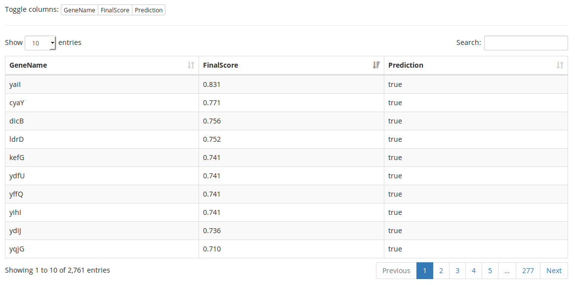
Figure 7: Interactive prediction table. For each gene ('GeneName' column), final score given by PreCisIon ('FinalScore' column) and discretized prediciton ('Prediction' column: 'true' if a gene is predicted as target for the current transcription factor, 'false' otherwise) are displayed. Every column of the table can be displayed or hidden using the “toggle columns” buttons. Searching is possible for the content of all columns of the currently displayed table. Table data can be sorted by one or more columns (here sorted by descending score). Basic information about the table is displayed at the bottom of it. If there are too many rows to display, the table is splitted into multiple pages. This table was generated using CRP as input transcription factor (235 targets), a TF motif length of 22 bp, a genome length of 4639221 bp and default values for the other parameters.
Boosting iterations
During each boosting iteration, the results given by the selected classifier can be browsed. In order to investigate the interplay between the information given by the position and the sequence classifiers, a Canonical Correlation Analysis (CCA) is performed using the scores of the target genes at each boosting iteration, for the classifier that performed better (i. e. with the smallest classification error) during this iteration. The results of this analysis are represented as an interactive correlation circle plot (figure 8) that can be used to explore the results of each iteration. When the CCA cannot be performed, meaning that one classifier performed better during all the iterations, the interactive correlation plot is replaced by a list of links.
Not all iterations may be represented on the correlation circle plot as when two observations give the same information, only one is kept to perform the analysis. When there is only one iteration for a classifier while performing the CCA, the correlation circle plot shows only one dimension and the dots appear as a diagonal line.
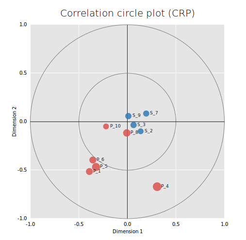
Figure 8: Interactive correlation circle plot. The two axes represent the first two “dimensions” of CCA (i.e. the two components which capture the highest correlation between variables). Data points tend to aggregate together when they are correlated. Positively correlated variables are projected in the same direction from the origin. The greater the distance from the origin, the stronger the correlation. The correlation between two points is negative if the angle that connects them (with the origin as the angle vertex) is obtuse and positive if the angle is sharp. Iterations where the position classifier performed better are represented as red dots, iterations where the sequence classifier performed better are represented as blue dots. The bigger the dot, the lesser the classification error. Clicking on a point will load visualizations for the two base classifiers. Data points are named as follows: <classifier name>_<boosting iteration> ('S' stands for sequence, 'P' for position). This plot was generated using CRP as input transcription factor (235 targets), a TF motif length of 22 bp, a genome length of 4639221 bp and default values for the other parameters.
For each iteration, the position classifier is represented as a clustergram for the most significant period found (figure 9) and the sequence classifier is represented as a sequence logo (figure 10).

Figure 9: Clustergram of Lrp target genes (visualization of the position classifier). The x-axis spans the length (in bp) of the most significant period found for the current boosting iteration, and corresponds to the phase (modulo-coordinates for this period) of target genes. On the left y-axis is the name and coordinates of genes, on the right y-axis is a normalized positional score of genes. Through this visualization, ''in-phase'' genes appear aligned vertically. Clustering is depicted by displaying genes belonging to the same cluster in the same color, and un-clustered data as grey points. This plot is shown when clicking a boosting iteration on the output page, and was generated using Lrp as input transcription factor (42 targets), a cluster exponent of 0.3 and a minimum cluster size of 3.
Figure 10: Lrp sequence logo (visualization of the sequence classifier). The x-axis corresponds to the position in the sequence and the y-axis to the information content of each nucleotide at a given position. The information content is measured in bits and ranges from 0 to 2 bits (a position in the motif where all nucleotides occur with equal probability has an information content of 0 bits, and a position at which only a single nucleotide can occur has an information content of 2 bits). This visualization is shown when clicking a boosting iteration on the output page, and was generated using Lrp as input transcription factor (42 targets) and a TF motif length of 15 basepairs.
References
Initial observation of periodic patterns in yeast co-regulated genes.
Periodic Epi-organization of the Yeast Genome Revealed by the Distribution of Promoter Sites
François Képès
Journal of Molecular Biology Volume 329, Issue 5, 20, Pages 859–865, 2003
PubMed
Periodic organisation of transcription in E. coli.
Periodic Transcriptional Organization of the E. coli Genome
François Képès
Journal of Molecular Biology Volume 340, Issue 5, 23, Pages 957–964, 2004
PubMed
Map of conserved regulatory sites for S. cerevisiae
(source of the sample data for multipatterns').
An improved map of conserved regulatory sites for Saccharomyces cerevisiae
Kenzie D MacIsaac, Ting Wang, D Benjamin Gordon, David K Gifford, Gary D Stormo and Ernest Fraenkel
BMC bioinformatics, vol. 7, no 1, p. 1, 2006.
PubMed
Algorithm and method for detecting periodicities.
Periodic pattern detection in sparse boolean sequences
Ivan Junier, Joan Hérisson and François Képès
Algorithms for Molecular Biology20105:31 2010
ALMOB
Description of the GREAT:SCAN:PreCisIon algorithm.
PreCisIon: PREdiction of CIS-regulatory elements improved by gene's positION
Mohamed Elati, Rémy Nicolle, Ivan Junier, David Fernández, Rim Fekih, Julio Font and François Képès
Nucleic acids research, gks1286, 2012
NAR
Visualisation of the interplay between position and sequence (PreCisIon)
Visualising associations between paired ‘omics’ data sets
Ignacio González, Kim-Anh Lê Cao, Melissa J Davis and Sébastien Déjean
BioData mining, vol. 5, no 1, p. 1, 2012
BMC
Application of GREAT:SCAN tools in archea genomes (protocol).
Protocols for Probing Genome Architecture of Regulatory Networks in Hydrocarbon and Lipid Microorganisms
Costas Bouyioukos, Mohamed Elati and François Képès
Springer Protocols Handbooks pp 1-16, 2015
Springer
Docker images (command-line tools)
Some users may want to run their jobs locally or to integrate GREAT tools to pipelines. To avoid having to install a broad range of dependencies for each one of them, and to enable users to use out tools on multiple OS (Unix, OSX, Windows), we decided to release the command-line tools as docker images. Please note that the images available for download are gzipped and must be uncompressed before use with docker.
These images are updated when new versions of the tools are used on the web portal.
Getting started with docker
Installation instructions of docker can be found on the official docker website.
GREAT:SCAN:patterns
The docker image for GREAT:SCAN:patterns can be downloaded from here. Here is how to use it (basic usage):
## Load the docker image for GREAT:SCAN:patterns
docker load -i great_scan_patterns.tar

## Start the 'great_scan_patterns' docker image interactively
docker run -ti great_scan_patterns /bin/bash

## Get the inline documentation
patterns.R --help

## Run a 'patterns' job with dataset 'dataset.tsv'
patterns.R -t job_title -l 4641652 dataset.tsv
GREAT:SCAN:multipatterns
The docker image for GREAT:SCAN:multipatterns can be downloaded from here. Here is how to use it (basic usage):
## Load the docker image for GREAT:SCAN:multi
docker load -i great_scan_multi_last.tar

## Start the 'great_scan_multi' docker image interactively
docker run -ti great_scan_multi /bin/bash

## Get the inline documentation
multipatterns --help

## Run a 'multipatterns' job
multipatterns genePositions tfTargets
GREAT:SCAN:PreCisIon
The docker image for GREAT:SCAN:PreCisIon can be downloaded from here. Here is how to use it (basic usage):
## Load the docker image for GREAT:SCAN:PreCisIon
docker load -i great_scan_precision.tar

## Start the 'great_scan_precision' docker image interactively
docker run -ti great_scan_precision /bin/bash

## Get the inline documentation
/workdir/precision_launch.py --help

## Run a 'precision' job with Lrp
/workdir/precision_launch.py -i 10 -j job_id Lrp
Using GREAT in pipelines
GREAT tools docker images can be used as parts of pipelines. Here is a simple example of a pipeline that might employ to further study genome layout of co-functional genomic features:
Feature Positions GREAT:SCAN:patterns GSEAnalysis
This simple pipeline might provide some insights for potential co-localisation of clustered genes, by looking for enriched GO terms into the predicted clusters of the clustergram analysis.
Known issues
Unable to upload a file
The GREAT:SCAN:patterns and GREAT:SCAN:multipatterns web interfaces use the HTML5 File API to handle file inputs. This should not be a problem for most modern web browsers. However, some old and/or exotic web browsers may not be compatible with it (see this link to check compatibility). If this is the case, you can still copy and paste your file to the text areas to use the tools.
Other issues
If you are experiencing something that is not documented here, please send us a message.
